
Introduction
Power BI is a great way to show interactive reports and dashboards to your executive leadership team utilizing your Project Online data. Microsoft recently announced a content pack where you can connect to your Project Online instance and it will auto-generate some pre-defined reports and a dashboard. This will get you started quickly with visualizing your Project Online data. In this post, I want to take it a step further and show you how to create a Power BI report from scratch that can be customized to your organizational needs. This should provide a good foundation on how reports are created and will allow you to create dashboards to share with your project stakeholders.
Get Started
DOWNLOAD: Power BI Template for Project Online
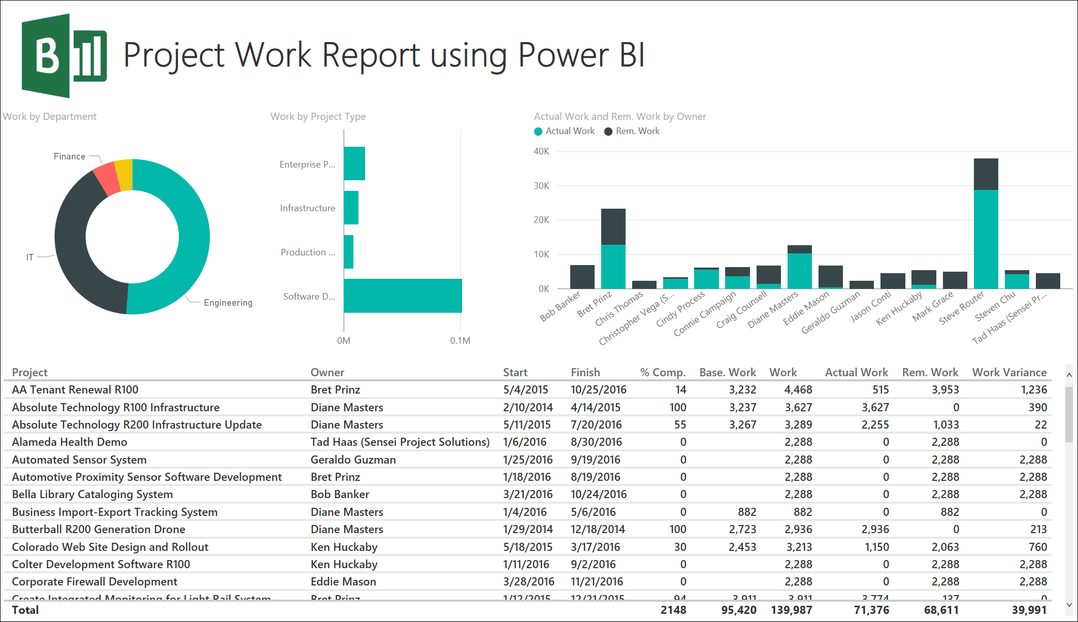
If you haven’t already done so, go to PowerBI.com and sign up with your work email address to create an account. You can start with the free account or upgrade to the Power BI Pro license if necessary. All of the steps in this post will work with the free account. The next thing you want to do is to download the latest version of the Power BI Desktop tool. This tool gets updated each month, so I recommend downloading it once per month to ensure you are using the latest features. In this post, I will show you how to create a simple Project Work report that joins a few tables and uses several features of the Power BI Desktop tool, and the Power BI service. This report uses all out of the box fields, but feel free to modify it with any custom fields for your organization. The finished report will look like the one shown below.

Connecting to Project Online
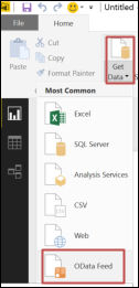
To connect to Project Online for your data, first launch the Power BI Desktop application then choose Get Data > OData Feed. To access the OData feeds in Project Online, you will need to be a member of the Administrators, Portfolio Viewers, or Portfolio Managers group if using SharePoint Permission Mode, or have the “Access Project Server Reporting” global permission if running in Project Permission Mode.
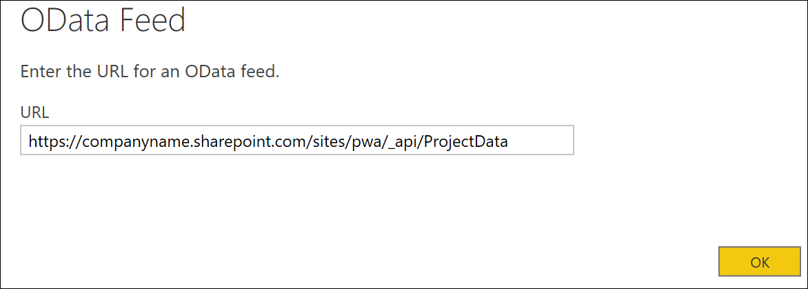
Next enter the URL for your Project Online instance name in the format of http://<companyname>.sharepoint.com/sites/<instancename>/_api/ProjectData. Substitute the <companyname> and <instancename> for your tenant and instance of Project Online. Enter your credentials to Project Online if prompted.
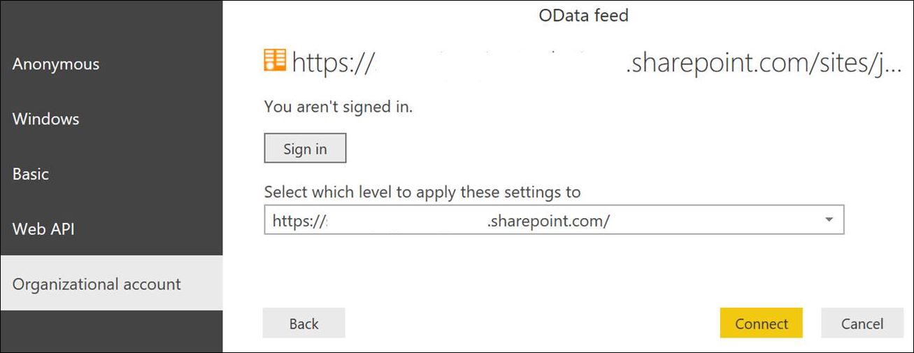
If you haven’t connected to this source before you will be prompted for authentication. Choose Organizational account and click the Sign In button and use your Office 365 credentials. Click the Connect button.
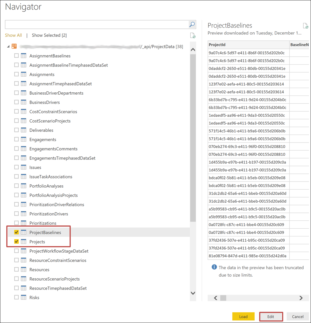
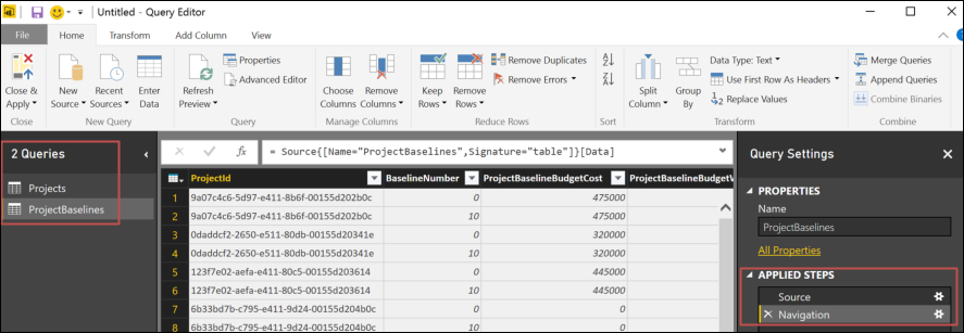
You now will be presented with the Navigator screen that shows you all 38 tables available in Project Online for reporting. In our example, I’m going to select both Projects and ProjectBaselines tables, then click the Edit button.
This will open up the Query Editor window where we can transform the data. As you can see on the left-hand side, we have two queries named Projects and ProjectBaselines based on the tables we selected in the Navigator. From here, you create steps to transform the data until you get the data how you’d like, then apply the data to your data model for reporting within Power BI Desktop.
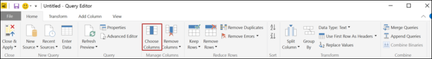
First, let’s go ahead and select only the columns we want to use in our report. To do this, go to the Choose Columns button on the ribbon from the Home tab.
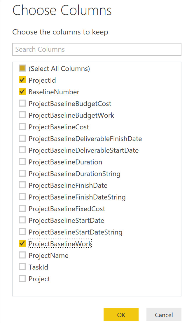
From the ProjectBaselines query, select only the ProjectId, BaselineNumber, and ProjectBaselineWork columns and click OK.
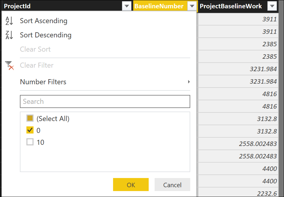
We now want to filter the rows to show only BaselineNumber 0 (original baseline). To do this, click the dropdown arrow from the column BaselineNumber, select the checkbox next to 0 in the available items, and click OK.
Notice that each action you take creates a new entry in the Applied Steps section on the right-hand side. Each step can be edited independently, renamed, or deleted.
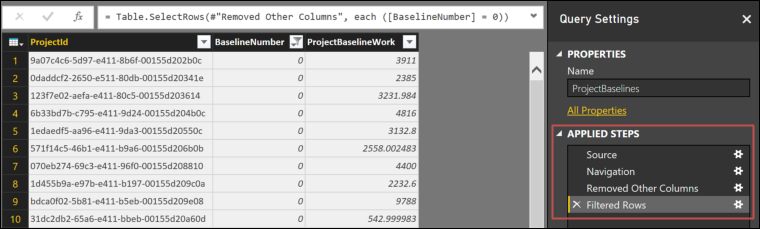
The final results of our ProjectBaseline query is now only showing us ProjectBaselineWork values for each Project (represented by the ProjectId) and filtering rows for values with baseline number equal to 0.
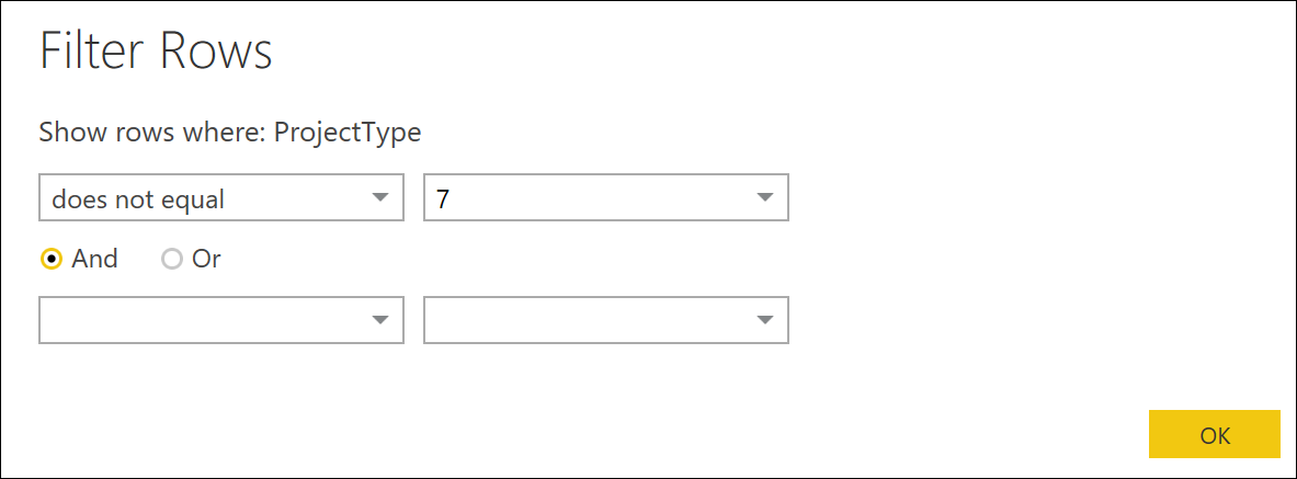
Let’s now switch over to the Projects query, and as before, click the Choose Columns button from the ribbon on the Home tab. For this query, let’s select the following columns: ProjectId, EnterpriseProjectTypeName,ProjectActualWork, ProjectFinishDate, ProjectName, ProjectOwnerName, ProjectPercentCompleted,ProjectRemainingWork, ProjectStartDate, ProjectType, ProjectWork, ProjectWorkVariance,ProjectDepartments, and click OK. Now, let’s add a filter like before on the ProjectType column, and this time choose Number Filter and Does Not Equal, then type in 7 and choose OK. This will filter out the Timesheet Administrative Line Items project row, which we do not want to display in our report.
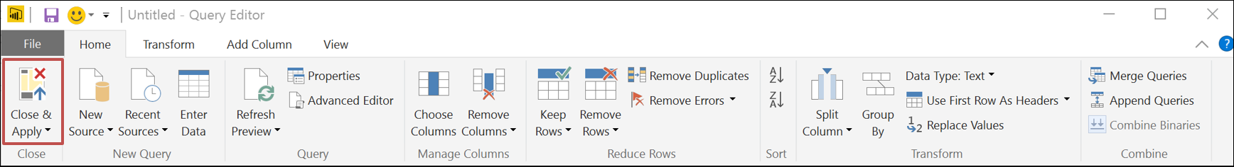
Now we have the data shaped correctly for our report. Click the Close & Apply button.
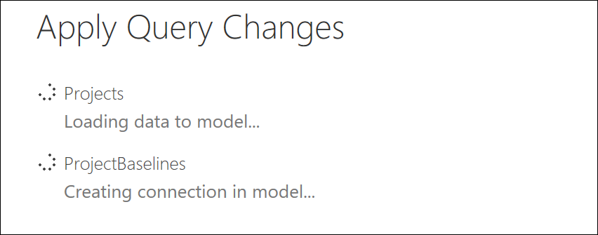
This will close the Query Editor window and apply the transformed data to our data model, which is now available for reporting. This process will also auto-detect any needed relationships between the queries and set them up for you.
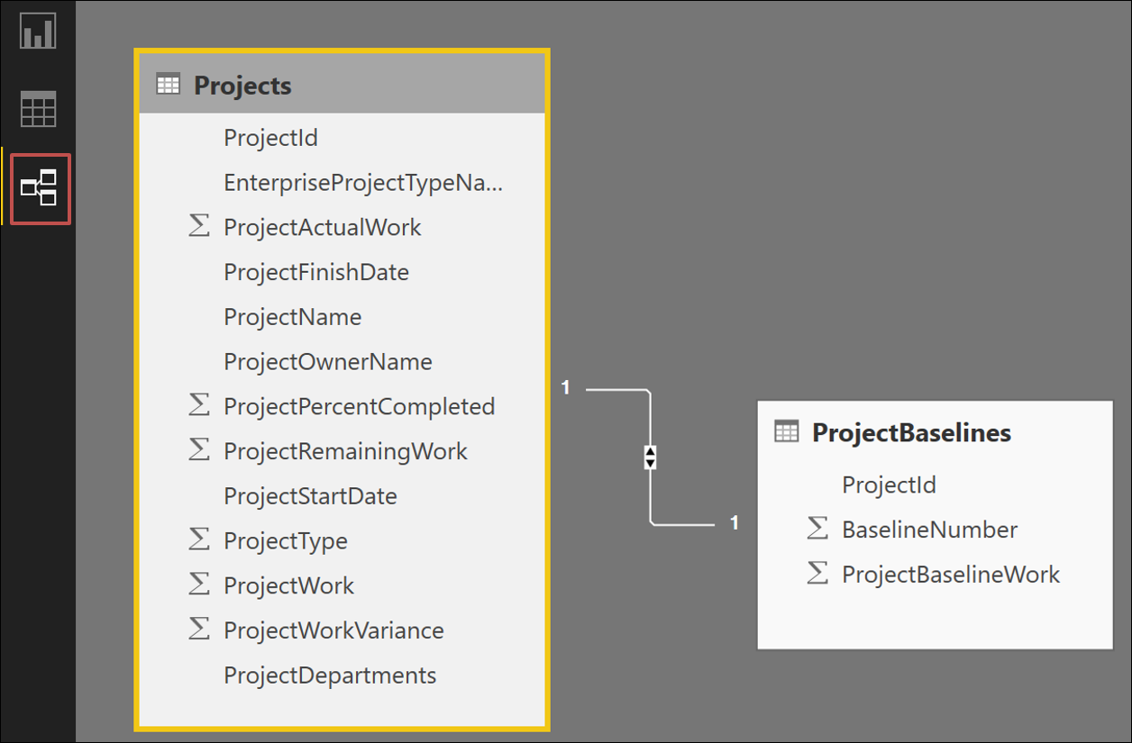
We want to join the ProjectBaselines query data to our Projects query using the ProjectId field as the unique value that is present in both queries. Most likely, Power BI Desktop already detected this relationship and set it up for you after you applied the data to your model. To check this, let’s go to the Relationships button (looks like three connected windows) on the left-hand sidebar navigation area. Here you see a 1-to-1 relationship, and if you hover over the line connecting the two tables, you see they are connected on the ProjectId column.
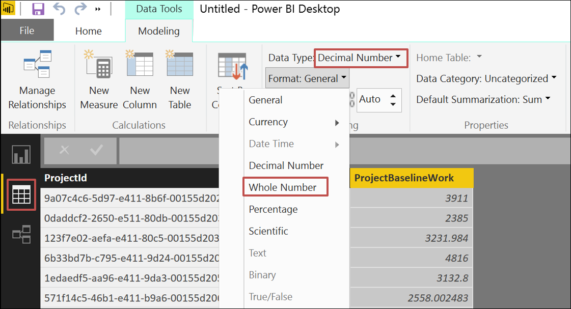
Now let’s click on the Data button (looks like a grid icon) in the left-hand navigation area. Here is where your data model exists and you can preview the transformed data, apply formatting, and add custom columns if you’d like. For this example, let’s do some number formatting. Click on the header of the ProjectBaselineWork column, choose a Data Type of Decimal Number and a Format of Whole Number, then click the comma button to add the comma separator for thousands. This will round the number to the nearest whole number and leave off the decimal point, which is fine for our reporting purposes.
Now, click the Projects query and use the same number formatting options for ProjectActualWork,ProjectRemainingWork, ProjectWork, and ProjectWorkVariance.
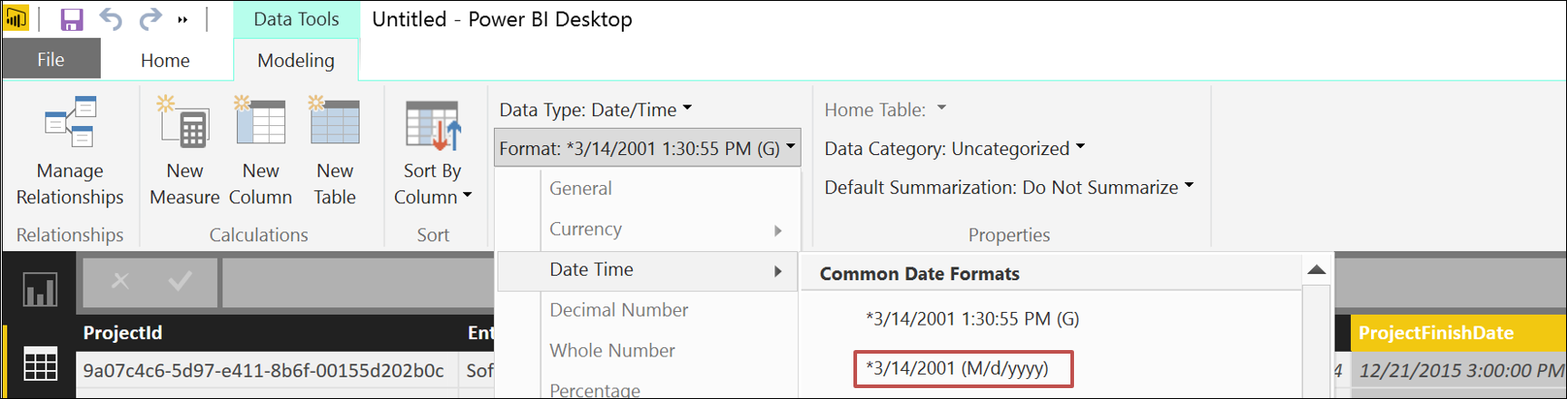
For ProjectFinishDate and ProjectStartDate, click on the header of each and choose Data Type of Date/Time and Format of *3/14/2001 (M/d/yyyy), or whichever date format you prefer that doesn’t show the time.
We now have the data transformed and formatted how we want, and are ready to create the report. To do this, click the Report button on the left-hand navigation (looks like a bar chart icon). You are presented with a blank canvas with tabs on which you create report elements. In the right-hand section, you see the Visualizations you can choose from and the Fields that are available.
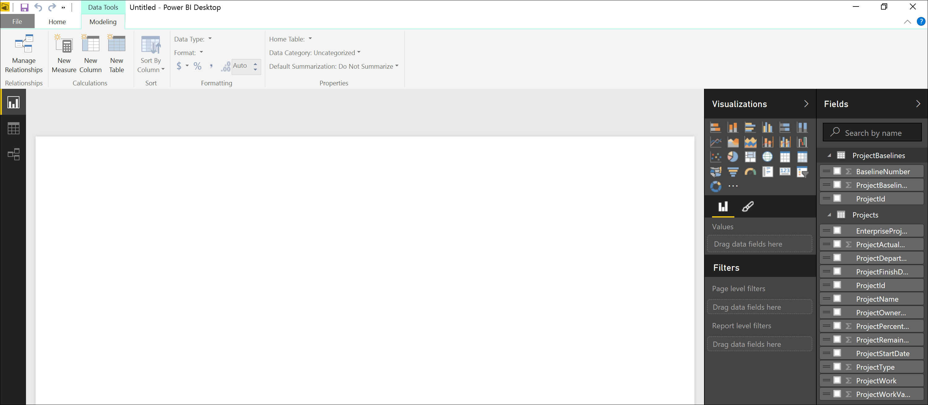
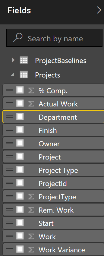
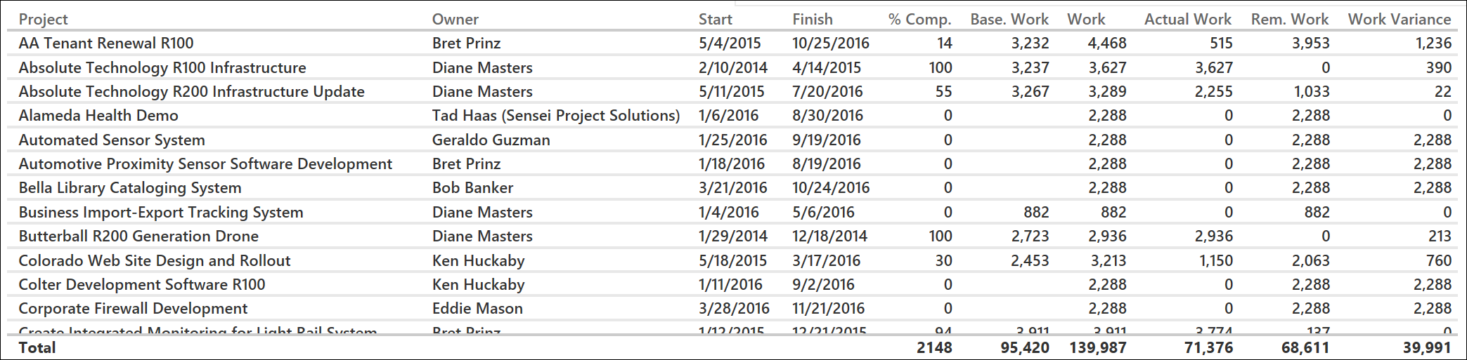
Let’s start with a simple table, which is the default visualization. Click the checkbox for the following fields: ProjectName, ProjectOwnerName, ProjectStartDate, ProjectFinishDate, ProjectPercentCompleted,ProjectBaselineWork, ProjectWork, ProjectActualWork, ProjectRemainingWork, and ProjectWorkVariance.
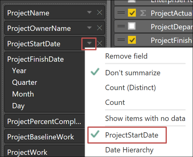
Let’s remove the Date Hierarchy from our date values by selecting ProjectStartDate on the down arrow in the values box, rather than the Date Hierarchy. Do the same for ProjectFinishDate.
Rename the values in the Fields by double-clicking each and typing in a shorter name.
Resize the table to fit across the page and move the table to the bottom of the report canvas.
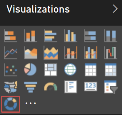
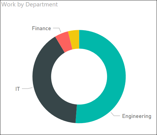
Next, let’s add some visual items to the report. Click in the white space on the canvas, click on the ProjectDepartments and Work fields, then change the visualization from a table to the Donut Chart. Go ahead and also rename ProjectDepartments to Department.
Your visualization should look like this.
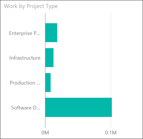
Next, add EnterpriseProjectType and Work. Rename EnterpriseProjectType to Project Type and change the visualization to a Clustered Bar Chart.
Your visualization should look like this.
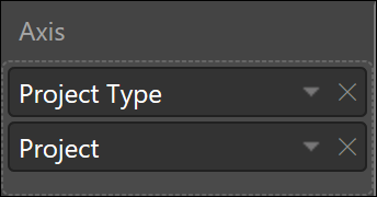
Now let’s add Project as a secondary axis value which will enable drill down capability on that visualization.
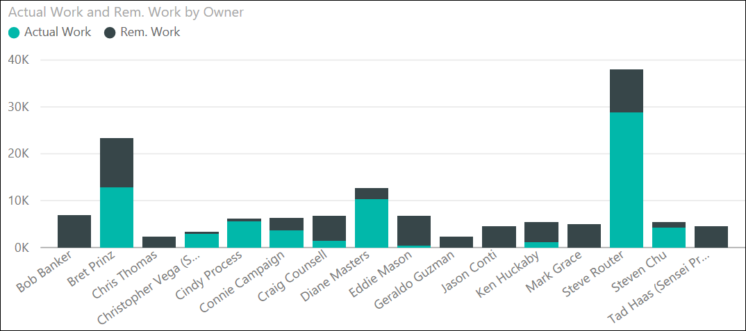
Next, add Owner, Actual Work, and Remaining Work, and change the visualization to a Stacked Column Chart.
Your visualization should look like this.
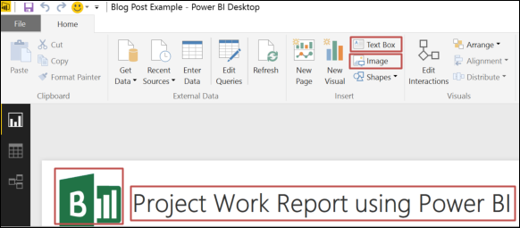
Add an image, such as your company logo, to the top left, then add a text box and add your report title.
Place these visualizations on the top below the logo and title, use Ctrl-click to select all three report elements, then use the Alignment > Align Top from the ribbon.
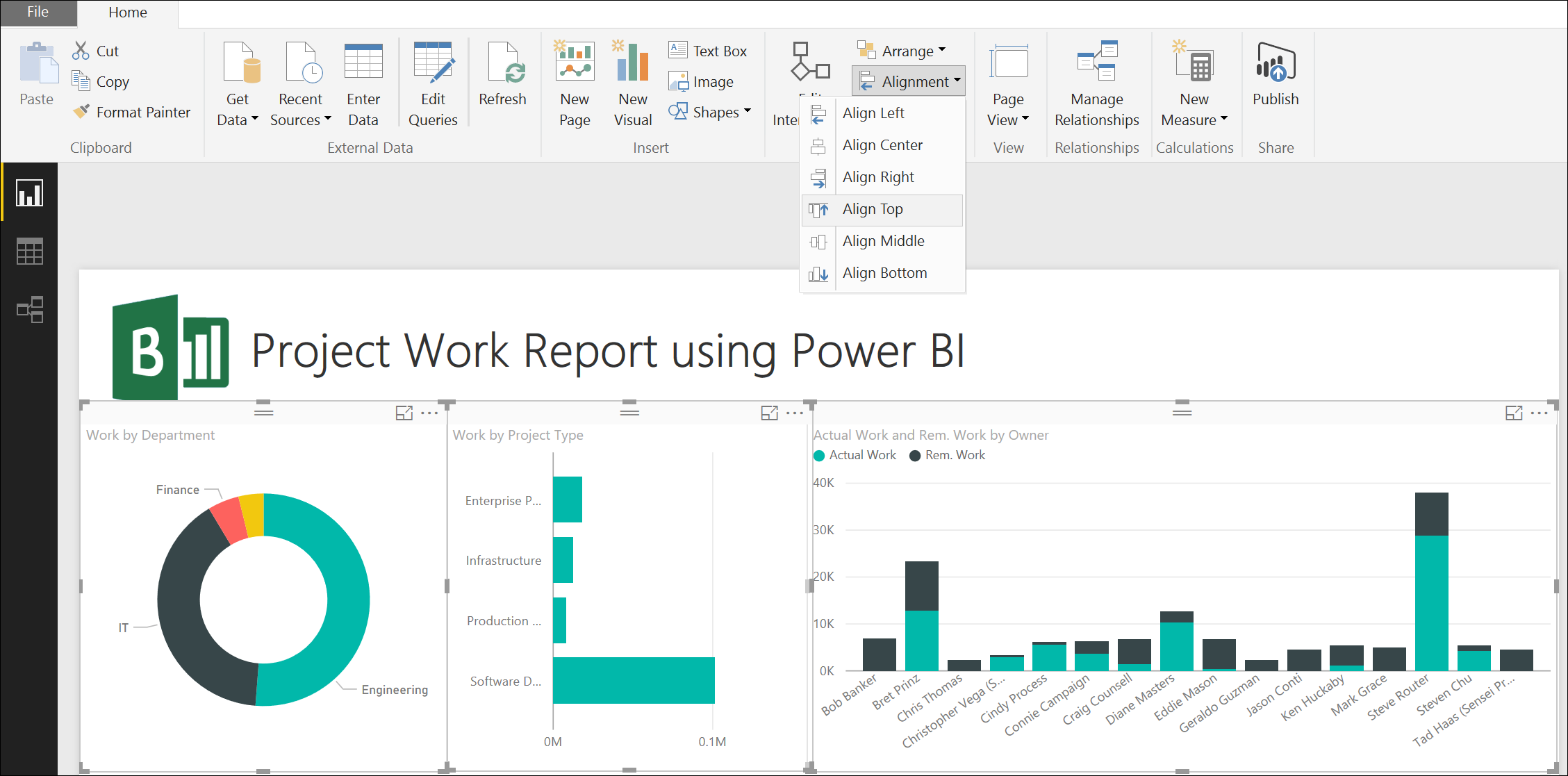
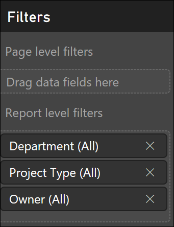
Let’s add some filters to the report so the user can easily filter all 4 of these visualizations at once. To do this, drag the Department, Project Type, and Owner fields to the Report level filters section. You could use the Page level filtersbecause you have only one page, but using the Report level filter gives you flexibility to add additional pages and have the filters work across all pages. Note, you can also cross filter by clicking on elements within the charts, in which case it dims out the other values. Using the Report or Page level filters removes the other data from the report.
Your finished report should now look like this.
Saving and Publishing
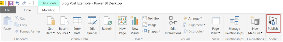
Save the file locally as a .pbix file so you can make modifications if needed, then click the Publish button from the ribbon to publish to PowerBI.com.
Sign in to Power BI if prompted, and you should get a Success message for Publishing to Power BI.
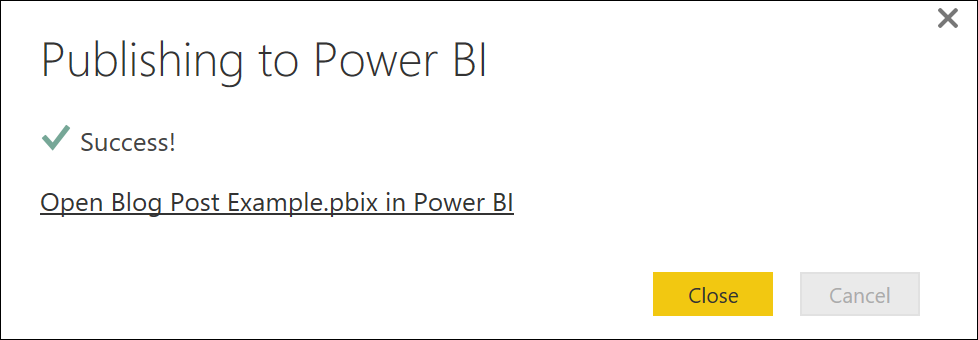
Click the hyperlink in the message box to open the report in Power BI, or alternatively you will now see it at PowerBI.com.
You now have a report and a dataset published in Power BI so you can do things like schedule data refresh on your dataset, add additional reports, create a dashboard, and pin selected report elements to your dashboard. If you are using the free version of Power BI, you only have these reports in your My Workspace, but you can share them with others who have Power BI by entering in their email address from the Share dialog box. If you have the Power BI Pro subscription, you can add reports to Office 365 Group workspaces and assign different permission levels to each member. You can also choose to create an organizational content pack that is accessible to other people in your organization. Another benefit of the Power BI Pro license is you can also choose to refresh the data hourly, as opposed to the once a day limitation of the free version.
Conclusion
I hope this walkthrough gave you enough information to get started with creating reports in Power BI for your Project Online data. We created a simple Power BI report connecting to Project Online to get some work values. We also joined a few tables and did some data transformation and formatting, put together four visualizations, and added some filters and drill down capability. The next step would be to create additional reports using other Project Online data such as resource information, assignments, timesheets, portfolio analysis, and other vast amounts of information that the Project Online OData feeds provide. From these reports you could create great looking dashboards to share with your executives. You should also check out how great these reports look using Power BI apps for mobile devices. See the Power BI Support documentation site for more information.

")