Microsoft continues to enhance the capabilities of Microsoft Project for the web, with the introduction of Charts, a project manager can now see the status of tasks in a project in chart views.
Similar to Microsoft Planner charts, a project manager can now get a quick visual on how projects are doing in three different chart views.
Microsoft Project for the web: E-Learning
Power BI Template for Microsoft Project for the web
As shown in the figure below, you’ll find the Charts tab on the main page next to Grid, Board and Timeline.
| Figure 1 – Charts in Project for the web |
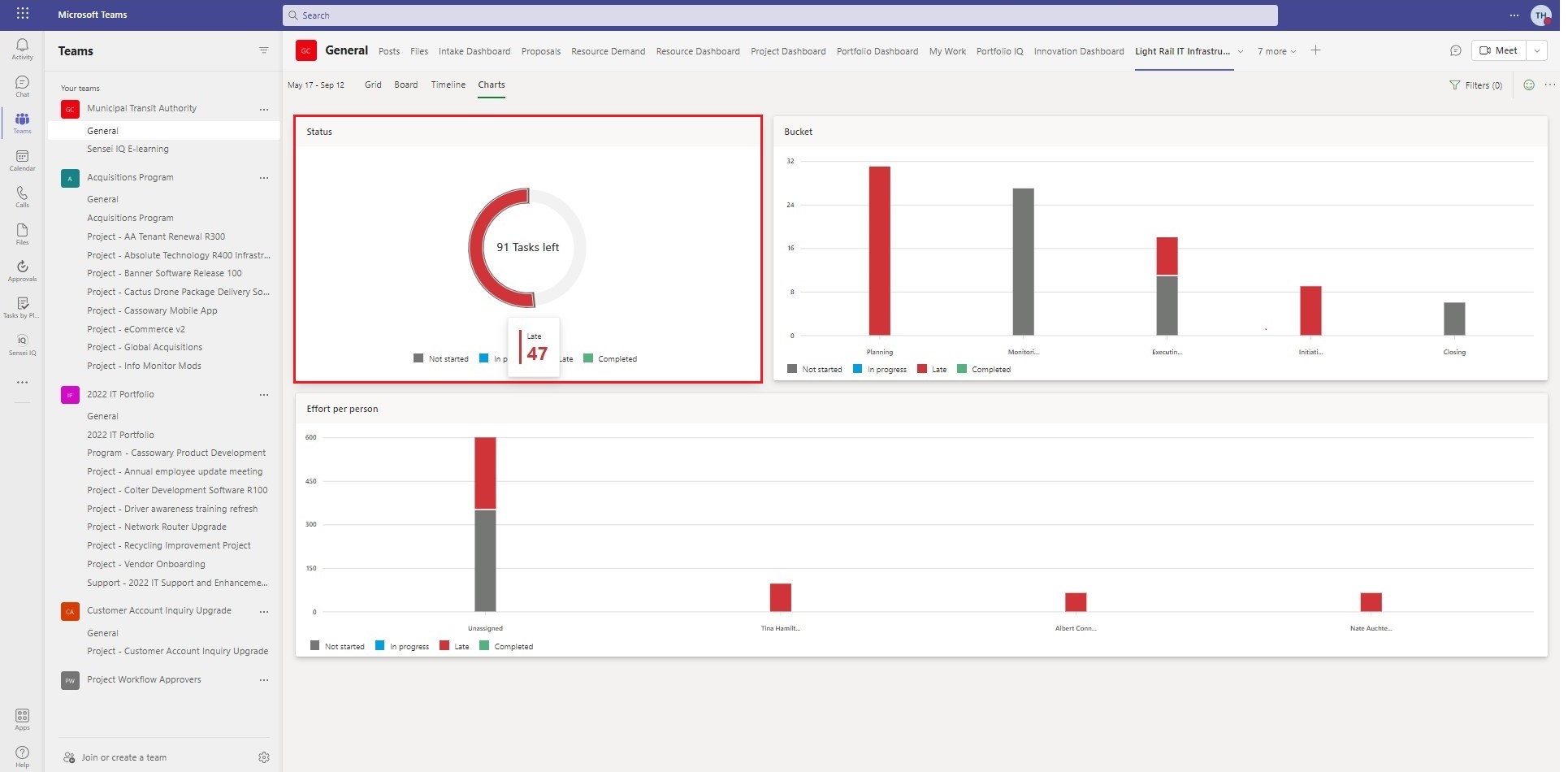
Microsoft Project for the web users now have the ability to hover over any chart to get further details. Figure 2 shows the overall status of late tasks.
 |
| Figure 2 – Task Status |
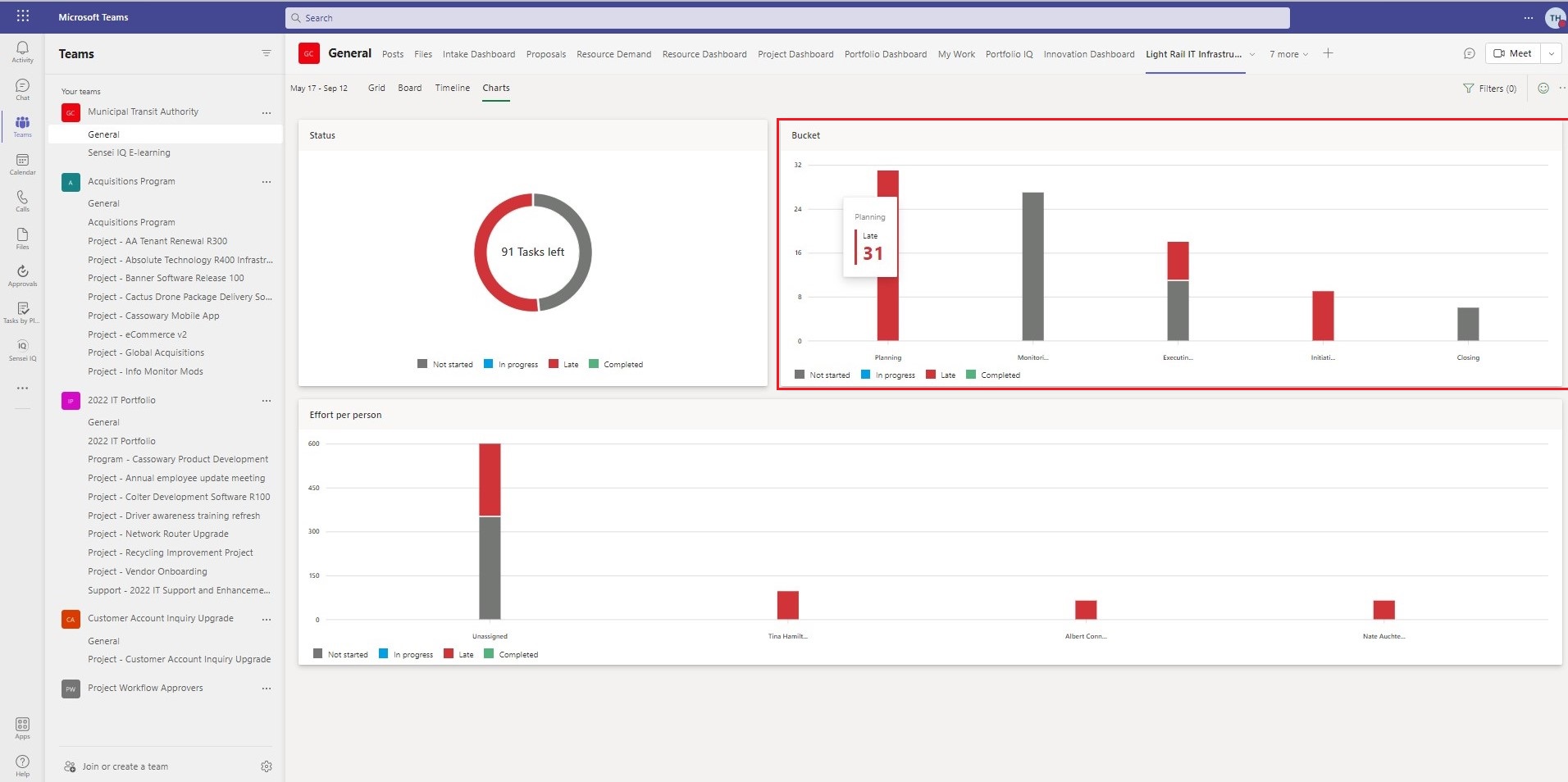
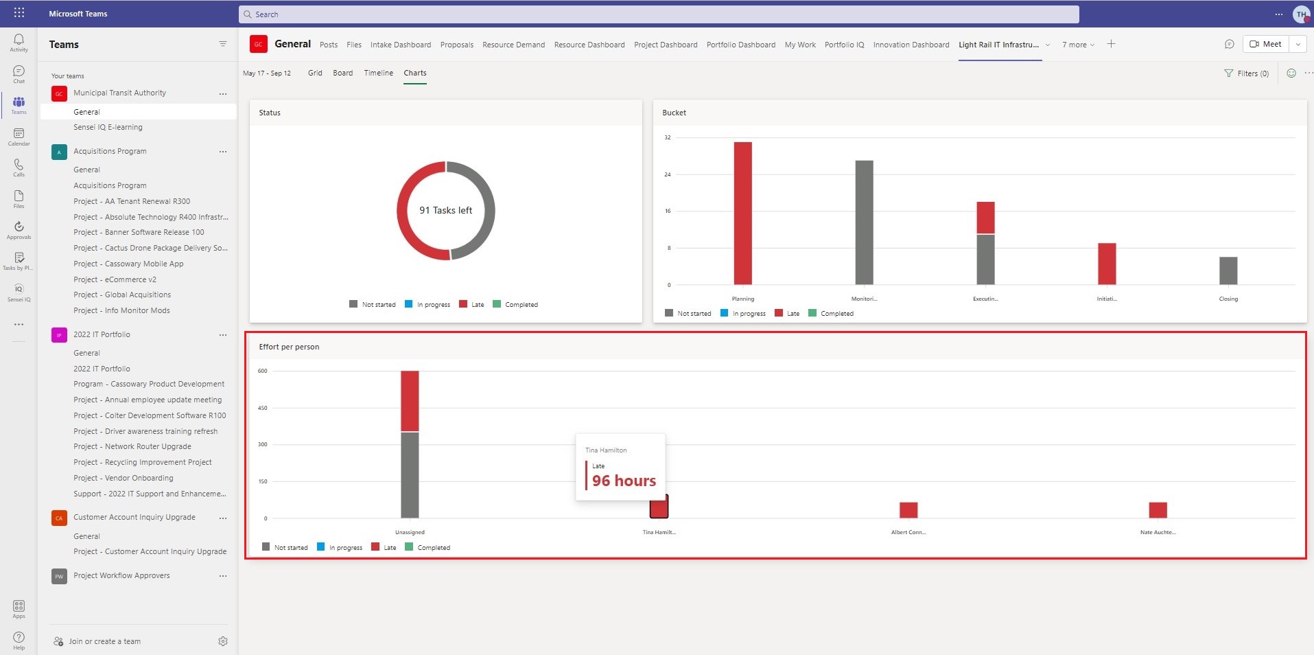
Figure 3 shows the number of late tasks grouped by bucket and Figure 4 shows the late tasks in effort by person.
 |
| Figure 3 – Status by Bucket |
 |
| Figure 4 – Status by Effort Per Person |
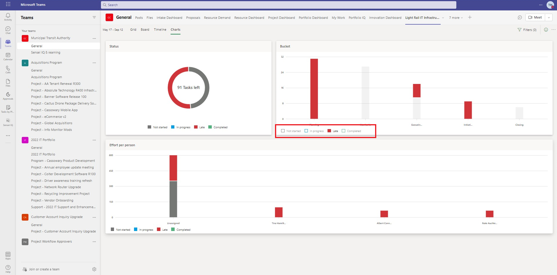
This feature also gives users the ability to filter the data in a chart.
 |
| Figure 5 – Filter Data in a Chart |
Charts within Microsoft Project for the web offers another handy tool for project managers a variety of ways to represent the data in their projects.

Client Success Manager, Sensei

Sensei Project solutions is a recognized global leader in Microsoft project and portfolio management (PPM) solutions focused on improving the way your team works. Sensei’s unique turn-key PPM Platform in the Microsoft Cloud, Sensei IQ™, is designed around your needs and a modern way of working. Sensei IQ™ helps you make informed decisions by understanding how all work fits together with meaningful insights into projects, resources and programs across your portfolios.